
September 1, 2021 • Cabinet Spot FInal
Click the gadget in the lower right corner for full-screen viewing.

March 16, 2021 • help wanted TV: rough
JUly 20, 2020 Cornerstone REFACE TV
NOTE: Still needs some fine tuning + color correction after client approval.
MAY 11, 2020 Cornerstone Granite TV • virus edition VO FIX + FOOTAGE FIX.
APRIL 24, 2020 Cornerstone Virus TV • Andy VO
(EDITED VERSION: NO TAPE MEASURE.)
APRIL 10, 2020 Cornerstone Virus TV • Andy VO
APRIL 9, 2020 • New VIRUS spot • 2 versions
Version 1 has a scratch VO. And if you hear a lot of “bells” in the background, that’s because it’s very windy here today and we have 8 or 9 wind chimes right outside my office window. Version 1 also has the abbreviated ending – without the locales – as a way to get people to focus on our virtual contact #s. Version 2 has no VO and the regular ending. If you want to change any kitchen or bath shots, let me know. And please see my email (coming later today) about the VO.
Script:
If you have one of these, and one of these, and/or one of these, you can still get one of these – your dream kitchen or bath – even now, during these difficult times. Cornerstone is working with customers by phone, email, and video chat… head to our website or call for details. In the meantime: we encourage all our neighbors to stay safe, follow all recommended guidelines, and remember: “this too shall pass.” When it does, we'll be here for you… like always.
APRIL 6, 2020 • Go for wow TV VIRUS EDITION
APRIL 6, 2020 • GRANITe TV VIRUS EDITION v-2
march 31, 2020 • VIRUS TV CONCEPTS – 2 of 3
This spot is more a rallying cry, and as such, it positions Cornerstone at as both a community leader (someone you can trust) and a good neighbor. And I hear Tony's voice in my head, but if not, a professional VO could make this spot very powerful. As for visuals, we could do any number of things. My first idea was snippets from summer parades, like this example, but without music. And we could incorporate words in a snipe or violator that speak to “virtual consultations,” though the VO would not address that. Nor should it. Here’s the VO script:
“To me, it’s what makes Southwest Florida so appealing: the fact that most of us came from somewhere else. We’re ex-New Yorkers, Bostonians, Texans and Californians… we're farmers and cowboys and stockbrokers and plumbers… and when we come together, as Americans, we can do anything – and if you doubt it, read some history. Yes, right now we’re in a battle, and yes, it’s scary… but do not, for a second, think we won’t win. Because we will. Because that’s what we do, here, in America. So from everyone at Cornerstone Builders, please: take heart, take care… and always, always: keep the faith. Thank you.”
If we pursue this one, the script needs work. We’ll talk.
march 31, 2020 • VIRUS TV CONCEPTS – 1 of 3
NOTE: I was planning on coming up with 2 or 3 ways to go, and then we could pick (or modify) the one we like best.
NOTE: whatever we do needs proper coverage on our site given how serious things are right now. As opposed to a couple of bullet points, I think we’d need some depth, as in facts / info on what exactly we’re doing to protect folks… plus how installation during these times would actually work, and what to expect – from us AND from the customer and/or the customer’s family.
march 11, 2020 • Granite TV • NO GEOGRAPHY
Re: the above. I was doing CS revisions while you were away, and this idea popped into my head, so I thought I’d send it along. A lot of folks have a small kitchen as a result of minimal / accessible square feet – small ranch homes, townhouses and condos, etc. (I know you know this.) And maybe they don’t think they can get (or afford) a kitchen makeover. So I’m wondering – is this a viable idea? If not, okay, no biggie.
Re: below. This is the fix to the addresses at the bottom of the bathroom ad. Once you approve, or revise, I’ll do all the ads. There are a bunch, so I want to make sure I got it right before proceeding.
march 5, 2020 • Granite TV • revised
Revisions: Naples Trail Blvd locale removed + audio fixed. This spot is ready for air once you approve.
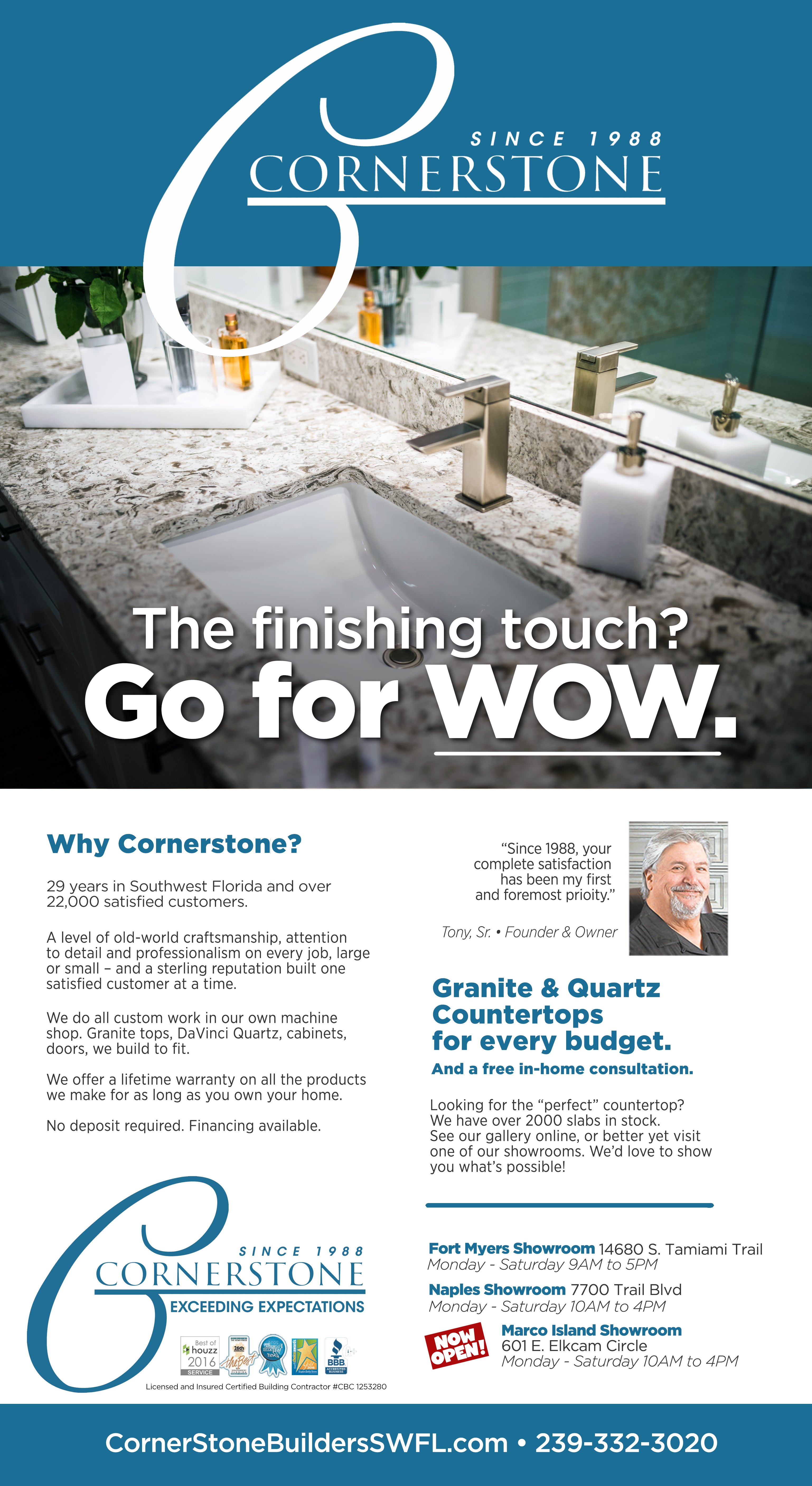
“Two things make a great countertop. The first: a beautiful piece of stone, and for that, our buyers search the world to bring SouthWest Florida a range of choices unequaled in the industry. From there, our own master cutters and finishers go to work... so whether granite, or quartz – you get a perfect fit and finish we Italians call “straordinario.” If you’re about to redo your kitchen or bath... come to one of our showrooms. Get inspired... “go for wow.”
cornerstone – airport digital Signs
Updated 10-9-19
CORNERSTONE revised reface ad • 4/11/19
CORNERSTONE :30 TV • 4/10/19
“10 Questions”
CORNERSTONE 30-SECOND TV • 2/22/19
“Beware of Low Bidders.”
Audio Remixed 2/22/3PM. I’ll have a final ready to go to the stations once I get approval.
Bathroom PRINT AD UPDATE 01-27-18
Leopardi’s Full Page Ad Comp • 10-25-18-NooN
Leopardi’s 15-Second TV • 10-19-18
Leopardi’s Mail comps • 10-18-18
Worth re-mentioning: if this restaurant is in a shopping center, you may want to have someone visit all local proprietors, introduce themselves, and give each one of the mailers + a business card with “20% off” written on it. It’s a good idea to make friends with the neighbors, and get them “talking up” Leopardi’s to their customers.
Please click each to view in the lightbox – so you can better see details and copy. Thanks.
I’m just leaving this here because it’s still a viable option. My third choice:
CS 30-second TV • Go for it • FINAL • 09-12-18
All revisions made. Posted on Dropbox on 9-12-18. Let me know who to send it to when you’re ready.
print ad UPDATE 07-30-18
Ad Revisions: in process / on-hold as discussed.
TRUCK WRAP UPDATE 04-18-18
Click each thumbnail for lightbox view.
VERSION A ABOVE. Drop Shadow on logo / one box.
VERSION B ABOVE. Drop Shadow on logo / one box / showrooms copy moved up, phone and url moved down.
VERSION C ABOVE. Drop Shadow on logo / one box / showrooms copy moved up, phone moved up, the word "showrooms" deleted, and the url is a little smaller.
Truck wrap update 02-02-18
Winning designs for review. Click each thumbnail for lightbox view.
Revised ads (4) • 01-23-18
all with anniversary BUG + license #
Press-ready files. Client proofing recommended.
ANNIVERSARY LOGO UPDATE
Truck wrap stock photography review
Revised bath ad 12-4-17
(Please proof one more time before publishing!)
ANNIVERSARY BUGS 12-29-17 ROUND 2
These new designs were done after our conversation this morning. I thought I should stop here, until we can discuss. You said you liked all the words in #8 from Round 1, plus you wanted a color, something that would pop, plus you liked the idea of a container, like a banner... so I did all of that. My opinion: all the words = 50 characters which is a lot for an anniversary banner, I think just 20 characters would do it, a simple "celebrating 30 years." We can all do the math (you started in 1988) and "celebrating 30 years " sounds more cheery than "30 year anniversary." That said, I do think some of these work fine, too many words or not.
P.S. I just noticed I mis-spelled expectations more than once. I'll fix that on any you want to consider.
A above. There are too many words to fit in a banner like this. Impossible to read in print, especially newspaper.
B above. This was the cleanest, least hokey way to still use a banner and keep all the words. From an ad design perspective, this works fine.
C above. But take away the banner, and it's cleaner, and maybe more sophisticated... ?
D above. Same as C but all red. Seems a little glare-y to me.
E above. Same as C but a different color combo. The gray goes well with the blue. Also more sophisticated than C or D imo, but it doesn't pop.
F above. I found this icon online under home remodeling icons. Works for me. (Says: "we love what we do.")
G above. Same as F but with a serif font instead of a sans.
H above. No one will think "these guys must be painters." (Like you always say, everyone know who we are and what we do.) The paint roller is just a cool device for a home remodeling ad banner – as legit as a hammer or a drill. I think this is definitely viable. Banners are technically "violators" – and are supposed to convey "we added this later" or "here's new info" and the roller does that well, and it's fun.
anniversary bugs 12-18-17
None of these are ready for primetime yet... but once we decide on one (or revise one) I will do the fine tuning. (Best viewed on an iPad.) The bugs in 5 THRU 8 can also be done in the logo blue color, which would keep it uniform, and I think I might prefer that. The bugs in 5 and 8 replicate a stamp effect with is why they are slightly off-kilter. (As if someone ink-stamped the logo with the mark.) Again, if you like one, I can dial it in and play with color combinations between the blue and dark gray.
(P.S. Some will work on TV better than others, some may be too fussy for TV.)
LATEST TRUCK WRAP UPDATE 12-12-17
11-27C could not take a stripe. Why = because all the type is below the white line, the stripe would be too thick and really take away from the photo. So I added the stripe to 11-27A and gave you two variations below.
12-12A is the translucent stripe at 64%, and 12-12B is the stripe at 100% opaque. I think you will agree: 12-12A looks nicer but 12-12B has better readability.
3 Caveats:
Small type is small type and harder to read than big type – and I can’t do anything about that. You may wish to share these with your truck wrap people for their thoughts. (Not on design, but on readability. I doubt they will have anything to offer, but who knows.)
Once we settle on which design is our winner, I need to make adjustments to the back. Why: we want the stripe to go all the way around the truck at the same height, so it looks uniform. To do that, type will have to move around some.
The color of the stripe is predicated on the color of the cab. I’m assuming that that color is the burgundy that the old trucks are… if it’s not, please let me know!
Last, I still LOVE 11-27E.
12-12A Above. Click or tap for lightbox view. Best on iPad. This one includes the translucent stripe at 64%. The back of the truck still needs adjusting.
12-12B Above. Click or tap for lightbox view. Best on iPad. This one includes the stripe as opaque at 64%. The back of the truck still needs adjusting.
LATEST TRUCK WRAP UPDATE 11-27-17
(Best to review on an iPad to see detail.)
11-27A Above. As we discussed, we added the phone number and url. I threw a drop shadow under the letters, but I am still concerned that white lettering at this size on top of a light photograph (like the bathroom shot) will not be very readable.
11-27B Above. This is the same as the first one, 11-27A, but I kept the translucent stripe to help with readability. The stripe wraps around the whole truck, so I think it ties everything together. (I am assuming that the new trucks will have that dark burgandy color on the cab, yes?)
11-27C Above. This one is a little different then the other 2 above. No stripe, and I painted a dark area under type where it needs it for readability. (I also flipped the kitchen.)
11-27D Above. Different type layout, no stripe.
11-27E Above. Just for discussion... something radically different. (I like it, but it probably won't fly.)
11-27F Above. Another variation for better readability.
11-17-17: granite ad FINAL
11-17-17: Bathroom Ad FINAL
11-17-17: RE-FACING AD FINAL
11-17-17: Final Kitchen Ad FINAL
Below, all the comps from the design stage, now for reference only. (The re-facing and granite ads are in here, as well as other variations we should hold on to.)
Latest Truck Wrap Update 11-5-17
Latest Truck Wrap Update 10-12-17
Added this morning – 10-23. (A new idea, a translucent background stripe so you can see the kitchen thru it. We could look at this approach on a few of the design ideas.)
A Above. Kitchen shot flipped horizontally. Logo large and in bottom left corner with white line extended. Not very readable against the bright background. When I change the color of the logo to something darker, it's worse.
B Above. Kitchen shot flipped horizontally. Logo large and in bottom left corner with white line shorter. Also not readable against the bright background, no matter what color the logo is. (White is best.)
C Above. Kitchen shot in natural position. Logo large and in bottom right corner with white line shorter. Also not readable against the bright background.
D Above. Kitchen shot flipped horizontally. Logo large and in bottom left corner with white line longer and dark shading added under the logo to help make it readable against the background. (Downside: the dark shading I added hides some of the kitchen detail.)
E Above. Kitchen shot flipped horizontally. Logo large and in bottom left corner with white line shorter and dark shading added under the logo to help make it readable against the background. (Downside: the dark shading I added hides some of the kitchen detail.)
F Above. Kitchen shot in natural position. Logo large and in bottom left corner with white line longer and dark shading added under the logo to help make it readable against the background. (Downside: the dark shading hides some of the kitchen.)
G Above. Kitchen shot in natural position. Logo large and in bottom left corner with white line at its proper length (this is the only comp that does that) and dark shading added under the logo to help make it readable against the background. (Downside: the dark shading hides some of the kitchen.) Of all options, this may be the best, but I have concerns. Recommendations for next steps: 1) give Christian the logo files to see if he can photoshop the type better. B) Send the finish to the truck wrap pros for their opinion before going any further.
On actual truck. (Very rough.)
Perspective Examples (Very rough.)
Print Ad Photo Selects 10.4.17
Kitchen Shot A above. (On this, the back doors / windows were photoshopped so we could see the lake / greenery.)
Kitchen Shot B above. I like it, nice shot, but I hate that window closed over the sink. The room feels less open. Less alive.
Kitchen Shot C above. Slightly different angle. Nice shot. Damn window.
Granite Shot A above. This is a tight crop. The mirror helps with depth, and there's a nice rack focus going on here (so some of the granite is focused and some isn't.)
Granite Shot B above. Nice composition here, better view of the sink. But it's subtle, no popping color.
Bathroom Shot A above. The bathroom is problematic in this house. It would be the same as the granite ad, so everyone would see the same bathroom in the two ads, bath and granite. Makes us look small. And though this shot showed the most stuff and felt the biggest, everything's a little out of focus, nothing is sharp. (Easier to see that at full size.)
CORNERSTONE TRUCK WRAP PRESENTATION • 9.19.17
The above is the original, all trucks presently have these elements and colors configured for big trucks, little trucks, vans, etc. I said it wasn't horrible, but there is much room for improvement. In my executions, I tossed the gold oval, which is very much a 1960s / 1970s design element. (Looks old and tired.) Obviously, it was used to make the logo pop off the imagery, but I looked to solve that problem other ways. My designs reflect the new ad look, which is a good thing to tie together. I also tried, where possible, to add a little "sell" (in a fun way). I think it's much more focused when we feature one room (a kitchen or a bathroom) on one panel, and not both. Ideally, we'd have a kitchen on one side, and a bathroom on the other.
I would make the back panel, the back of the truck, work much harder, and treat the back as our resume. Given you'd have to be sitting behind the truck in traffic to see it, folks will read it. I would also use the huge C (more like a G to me) watermark o the back. And I much prefer the logo on the cab sans the oval. It's much cleaner.
The comps below are not totally dialed in... I'll do that if we pick a design.
#1 This is my Manhattan / mid-town approach. Super clean, lots of negative space. This leaves some to the imagination. My opinion: if we show a particular kitchen and folks don't like that particular kitchen, we lose. Click for lightbox view.
#2 This is the same as the above, but from what I can tell from the photos you sent me, all Cornerstone trucks are painted that burgandy color, so I figured I should keep that color so cabs match trailers. (Make sense?) Click for lightbox view.
#3 This, and the few that follow, are essentially ads on wheels. (ABC a la Alec Baldwin.) I made the headline huge so you can read it from down the street, or even passing at high speed. This helps also makes the connection between outdoor and print. (Always good.) Click for lightbox view.
#4 Same thing, different kitchen. Click for lightbox view.
#5 Same thing, different kitchen. Click for lightbox view.
#6 Same elements, different layout. I like tucking "Cornerstone" in the corner, and making the water mark white line much wider top and bottom. Click for lightbox view.
#7 This one turns our trucks into "best-of" scrapbooks... "look at our work, it's beautiful. See anything you like?" I also like spelling out the call-to-action along the bottom. Click for lightbox view.
#8 This one brings a few ideas together at the expense of some words. But my plan for the back panel would cover everything we need to cover.
#9A This is what we talked about (See my notes 9-20-10AM) Below are two variations.
#9B This is what we talked about, but here I got rid of the top white line as well.

#9C And this is also what we talked about, but here I got rid of the top white line and I brought the logo down so it's not tucked up into the corner like 9A and 9B. However, when I do that, the burgundy stripes get thicker so the kitchen gets thinner. Not necessarily a deal breaker. I like putting the logo up into the corner, as in 9A and 9B, (we are Cornerstone after all) but I wonder if people will think that's a mistake. Whichever way we go, we have to keep the width of the burgundy line the same, top and bottom.
#9C GOLD. Check this on your iPad when you get a chance and tell me what you think of gold type instead of white. Your present trucks do gold type on burgundy (very Italian). It's not as easy to read as the white, but it is a little richer. What do you think? Zap me an email... no rush.
#9C GOLD + GLOW. This is the same as the above, but I added a slight glow to the letters to make it brighter. I'm starting to do what a lot of truck wrap people do, add lots of effects. Not ideal, but if it works, it works.
#9C GOLD + GLOW / FRONT & BACK. I want the burgundy stripe to be the same size on all sides, so it's like a ribbon around the truck.
BELOW INSERTED 10-5-17. (updated with ovals.)
Above: This is just a photo of the oval on his current truck(s) for reference.
Above: Truck with Oval A. No comment.
Above: Truck with Oval B. (Same as A but I put in our winning kitchen shot.)
Above: Truck with Oval C. (Smaller top and bottom stripes. Makes the type seem crowded. Jammed in.)
Above: Truck with Oval AND white stroke around Cornerstone, just like the old trucks. (Details like this white stroke will be easier to see on your iPad.)
CST-10 Above. 1) Guys love tools. 2) Guys respect craftsman, real craftsmen. 3) This shot says "custom." And there's nothing above you don't already have in the shop. This gives us an old-world worldly-ness. The real deal.
CST-11 Above.
CS-12 Above. The resume approach I talked about.
CS-13 Above. The resume with the watermark.
I'm really trying to get an honest feel for how this (or any of the designs) would look on the street. One thing for sure, my burgundy color is off, it's too brown. (It's hard to make out what it is from the photographs. If there's any chance Tyler could call the truck wrap people who did the trucks and ask them... what exactly is that color #?) Also, I added a shadow behind the burgundy stripes, which makes it look like that kitchen is actually there, like you could walk into it. Like it's IN the truck.
#10 Above is from one of the photos you sent me. I did try everything on an actual truck, just to make sure things worked like they're supposed to.
CORNERSTONE / GOODDEALS Co-BRANDING • 10.4.17
Best to view this on your iPad, not your laptop. (Half the pixels won't even show up on your laptop.) This looks way more like the Naples I saw... the shops, galleries and restaurants by the water. Upscale. Less like Kohls or Jerry's Chip & Putt, more like Restoration Hardware / Pottery Barn. If you like it, I can give you the design rationale. If not, no biggie... I'll toss it. GG
ABOUT THE BELOW.
(Pssst, Please do not share the below just yet. This took about 3 hours, but they're not good enough for a client to see... I'd have to tidy them out so they look more realistic, but that's another couple of hours all by itself. This is just for you and me to talk about for now. The first 2, (day and night) = best case scenario. What I'd like to see, but your sign guy will have a heart attack and give you 50 reasons why we can't do this. (None of them having anything to do with county sign regulations.) The next 2 (say and night) are definitely doable, but I'd have to do a ton of finessing to make it beautiful. Again, just for conversation sake.